
 Construction & Real Estate
Durva Enterprises
Durva Enterprises had grown into a serious construction and real estate firm, but their visual identity hadn't grown with them -- a dated, generic logo that gave no signal of scale, permanence, or engineering discipline. In a category where trust is the entire sale, the brand was quietly working against every pitch.
Construction is a high-stakes, high-trust category. A client committing crores to a builder reads the logo on the site board as a proxy for the company's competence long before they read a single credential. An amateur mark was costing Durva deals it never got a chance to lose on merit.
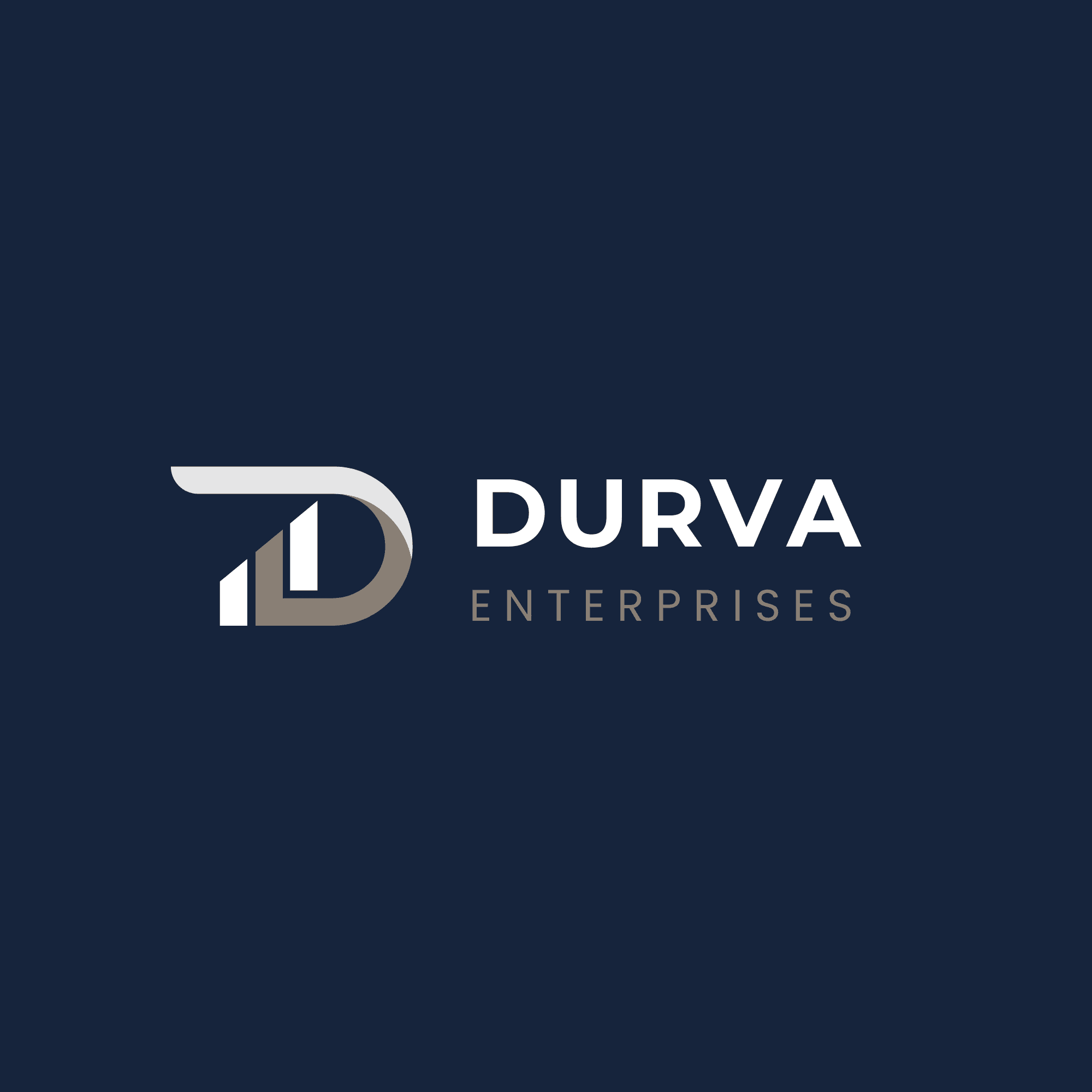
We built a disciplined monogram system around the initials, using structural, architectural forms that echo the company's own work -- clean verticals, confident geometry, a mark that reads as engineered rather than designed.
We built the monogram from structural forms, not decorative ones.
A construction firm's mark should look load-bearing. We built the 'D' from overlapping vertical strokes that suggest structure and elevation -- the same visual logic as a building's frame -- rather than a soft, rounded, generic wordmark.
What we rejected: A construction firm's mark should look load-bearing. We built the 'D' from overlapping vertical strokes that suggest structure and elevation -- the same visual logic as a building's frame -- rather than a soft, rounded, generic wordmark.
We limited the palette to navy and taupe -- no bright accent.
Durva's clients are institutional and conservative -- developers, contractors, banks financing the projects. A loud identity would read as unserious in rooms where the decision-makers are risk-averse by profession. Navy and taupe read as established rather than emerging.
What we rejected: A brighter accent colour to help the brand stand out on social media. Correct for visibility, wrong for the rooms where Durva's actual deals get signed.
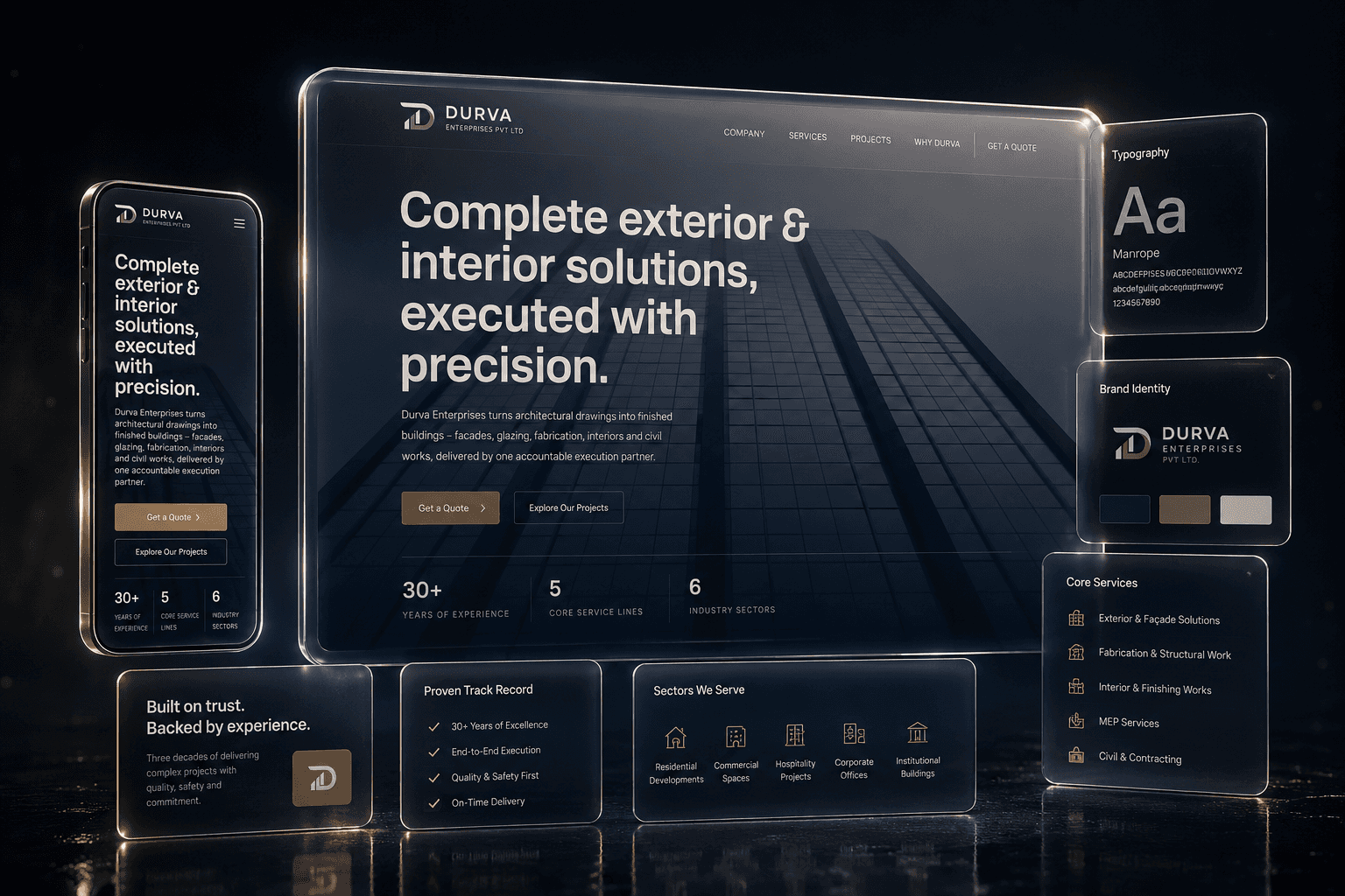


ELM understood that our brand needed to communicate restraint rather than excess. The result is a refined identity and website that lets our work speak for itself while giving clients confidence from the first interaction.
— Fahad Kazi, Managing Director
We underestimated how much production detail a construction client's stationery actually needs -- letterheads that work when printed by a site office on a basic printer, signage that survives Mumbai's monsoon. The guidelines document grew twice as long as planned because 'works in the real world' is a harder standard than 'looks good in Figma.'
