

Green & Cobalta had spent twelve years building a reputation in Mumbai's luxury interiors market through word of mouth and project excellence. Their work spoke for itself to people who saw it. To everyone else, they were invisible. Their existing brand was indistinguishable from a hundred other interiors firms.
Every month without a repositioned brand was a month of enquiries from clients shopping on price -- clients who could never pay for the quality of work the firm actually delivers.
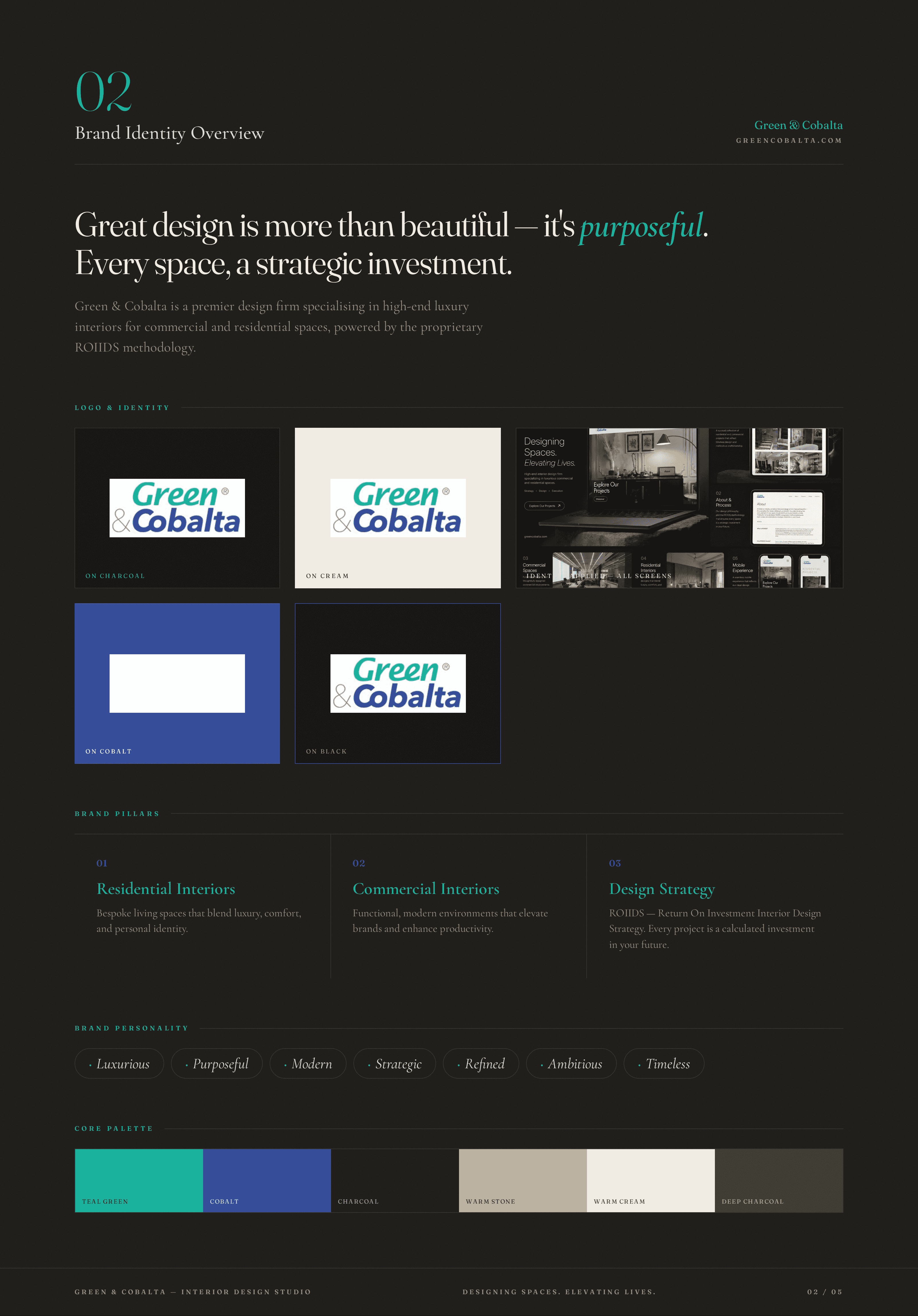
We rebuilt the brand from the methodology up, making the firm's proprietary ROIIDS process the centrepiece, splitting the identity between two temperatures for two audiences, and giving the brand three explicit pillars instead of a vague promise.
We built the brand around a proprietary methodology -- not a visual style.
Most interiors firms differentiate on taste, which is subjective and impossible to sell to a stranger. Green & Cobalta had a genuine process -- ROIIDS -- that treated every project as a calculated investment. We made that process the brand's centrepiece.
What we rejected: Most interiors firms differentiate on taste, which is subjective and impossible to sell to a stranger. Green & Cobalta had a genuine process -- ROIIDS -- that treated every project as a calculated investment. We made that process the brand's centrepiece.
We split the identity between two temperatures: teal-green and cobalt blue.
The firm's name already contained two colours. Teal carries the luxury and the natural world, cobalt carries the authority and precision. The dual palette lets the brand shift register between audiences without needing two separate identities.
What we rejected: A single-accent palette. Cleaner, but it would have forced the firm to choose between its residential and commercial identities.
We gave the brand three explicit pillars instead of a vague promise.
Residential Interiors, Commercial Interiors, Design Strategy. Three things, named and explained, rather than a paragraph of adjectives. A visitor knows in seconds exactly what this firm does and can self-qualify.
What we rejected: A single-accent palette. Cleaner, but it would have forced the firm to choose between its residential and commercial identities.




"ELM didn't just make Green & Cobalta look better—every decision came with a reason we could defend in the boardroom. That's the difference between decoration and design."
— Saad Shaikh, Founder
We spent the first week designing a single-accent identity that was, in hindsight, a house-style imposition rather than a response to the brief. The dual teal-cobalt system emerged only after we went back to the firm's name and asked what it was actually telling us.
If we did this project again, we would begin with the methodology workshop earlier -- the ROIIDS framework was the single biggest brand asset, and we found it in week three instead of week one.
